4 Design
So far, this thesis has established some important notions that we use as input to the design of AlphaTrainer: (i) from the Background Chapter 2 we learned that alpha feedback training can benefit to reduce stress; (ii) from the BCI Evaluation Chapter 3 we learned that the MindWave Mobile BCI is feasible for building an alpha feedback training system; and (iii) in the Introduction Chapter 1 we presented our overall method which includes the need for a robust system deployable for real world use.
These three notions span the design space for building AlphaTrainer. This chapter first describes the design model and method used and then moves on to explain some of the important design activities and choices made during the design process and finally present the design of AlphaTrainer.
4.1 Design model and method
This section presents the model used throughout the design of AlphaTrainer and the set of methods used during the design process. We start out by placing the design problem at hand within a Human-Computer Interaction (HCI) context which motivates the choice of design model.
The ISO 9241-210:2010 standard for "Human-centred design for interactive systems" states the following about HCI design:
"The complexity of human-computer interaction means that it is impossible to specify completely and accurately every detail of every aspect of the interaction at the beginning of development. Many of the needs and expectations of users and other stakeholders only emerge [...] as the designers refine their understanding of users and their tasks, and as users are better able to express their needs in response to potential solutions" [31] Section 4.5 p. 6.
Since we are designing a system which aims to enable a currently non-existing practice - namely to perform alpha feedback training on a mobile device in an everyday context - we are certainly struck by the complexity in regard to specifying user needs up-front.
When designing for ubicomp, additional aspects has to be taken in consideration which further increase complexity: (i) different devices; (ii) mobile users; and (iii) changing environment and context [8]. We recognize that we are not only designing interfaces but also designing interactions between people and the system through some artifacts embedded in an environment [10]. In a neurofeedback training system we have: (i) a user; (ii) using artifacts in form of the mobile device and the headset; and (iii) in an environment with a lot of parameters such as noise, changing lights, other people etc. This requires us to think of the interaction in context - in-situ - at home, at work or somewhere in between (e.g. when commuting) [12] [3].
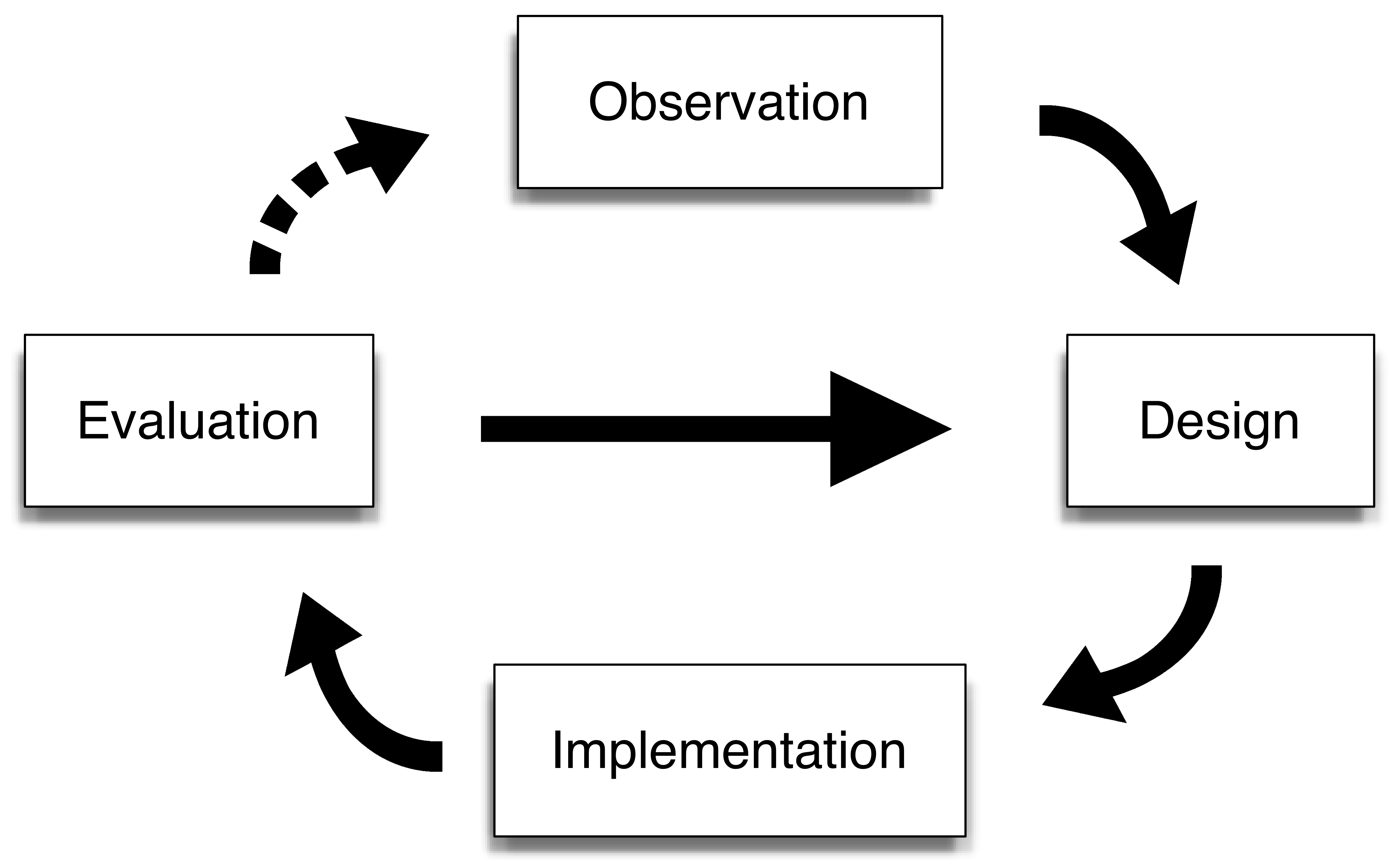
To deal with the complexity and difficulty of specifying user needs and system requirements up front, we take a user centered approach to our design process. This approach enables specifications to emerge during the design process through experiments and prototypes from which we will learn and design new experiments and prototypes [12] [34]. We have drawn the model in Figure 4.1.
To envision the needs and goals of the users of our system we have been using personas and scenarios [35][13]. A persona simply model a certain user in order to delimit the target group for whom we are designing AlphaTrainer. We have created four personas named Morten, Niels, Olivia and Peter (Appendix Design - personas). We are using scenarios to frame the context and situation when and where the system is used. As a subset of scenarios we have worked with some simple storyboards to capture the setting, sequence and satisfaction of the actual alpha training (Appendix Design - storyboards).
One of the storyboards cover a work scenario and the person could be Peter (Figure 4.2). Peter has had a busy day with a lot of meetings and deadlines waiting around the corner. It is 11.30 and he realizes that he can squeeze in alpha feedback training just before lunch to get his mind clear. Peter finds a silent spot in the office space which mostly consists of big open spaces but luckily there has been arranged some quiet spots around. He chooses one of the feedbacks with sound because it is convenient to use when training with earphones in an office environment. First he does the calibration, then the reference recording as the app asks for and finally he performs three 5 minutes training sessions in a row. He improves his alpha during training and finds himself in a relaxed mental state after the training. Back to work.
4.2 Design process
Since we have deployed an iterative approach to the design process, we have decided to present important design activities and decisions chronologically. This clarifies how we continuously have fed the output of one design activity as input to another.
4.2.1 Initial experimental prototype
We started out by making a very simple prototype in the form of an Android app as proof of concept on getting data from the NeuroSky MindWave Mobile BCI and to tryout of their SDK signal processing. In a bottom up approach to investigate what we could control by means of alpha levels, we tried assigning different audio parameters (volume, pitch, placement in 3D perspective) to the SDK power band values for low and high alpha. The power band values are listed in Section 2.2.2.
We tried out the prototype informally on our selves and on fellow students and learned that the SDK alpha values contained giant outliers as already mentioned in the BCI Evaluation Chapter 3. Besides, we were unsure whether to use the low alpha or high alpha frequency band from the SDK since the literature states - as explained in Section 2.3.2 - that the alpha band varies between individuals and that neurofeedback is significantly more effective when the feedback is given on individually adapted frequency bands.
In researching how neurofeedback is practiced, we contacted Ann-Helen Pettersen - one of the few Danish psychiatrists specializing in neurofeedback therapy 1. She also stressed the importance of accounting for individually determined frequency bands. When practicing neurofeedback therapy, she starts out by recording a map of EEG frequency intensities. This "brain map", as she calls it, serves as input to the choice of an appropriate feedback frequency band.
Based on the notions from the literature on alpha feedback training backed up by a clinician's neurofeedback practice, we decided that our alpha training system would need the ability to give feedback on an alpha band adapted to the individual alpha peak frequency. This led us to experiment with doing the frequency analysis our selves. This also enabled us to test whether we could reproduce the outliers experienced from the SDK alpha values which would inform about whether they originated from the raw data or from the SDK processing.
We did the signal processing offline (see Section 3.1) and interestingly we were not able to reproduce the outliers we got from the SDK. Another interesting find during the data analysis was that the alpha wave intensity comes in chunks of a few seconds length as can be seen, for example, in Figure 3.7c. The chunks of high alpha activity can even be observed directly from a raw EEG signal such as the one shown in Figure 2.1.
4.2.2 Early functioning Android prototype
As the next step we implemented a working Android alpha feedback training prototype. We focused on the needs for custom signal processing revealed in our previous prototype experiments and from the literature. Our approach to signal processing is covered in the Implementation Chapter 5. We also created a set of 5 different feedback views inspired by other neurofeedback systems.
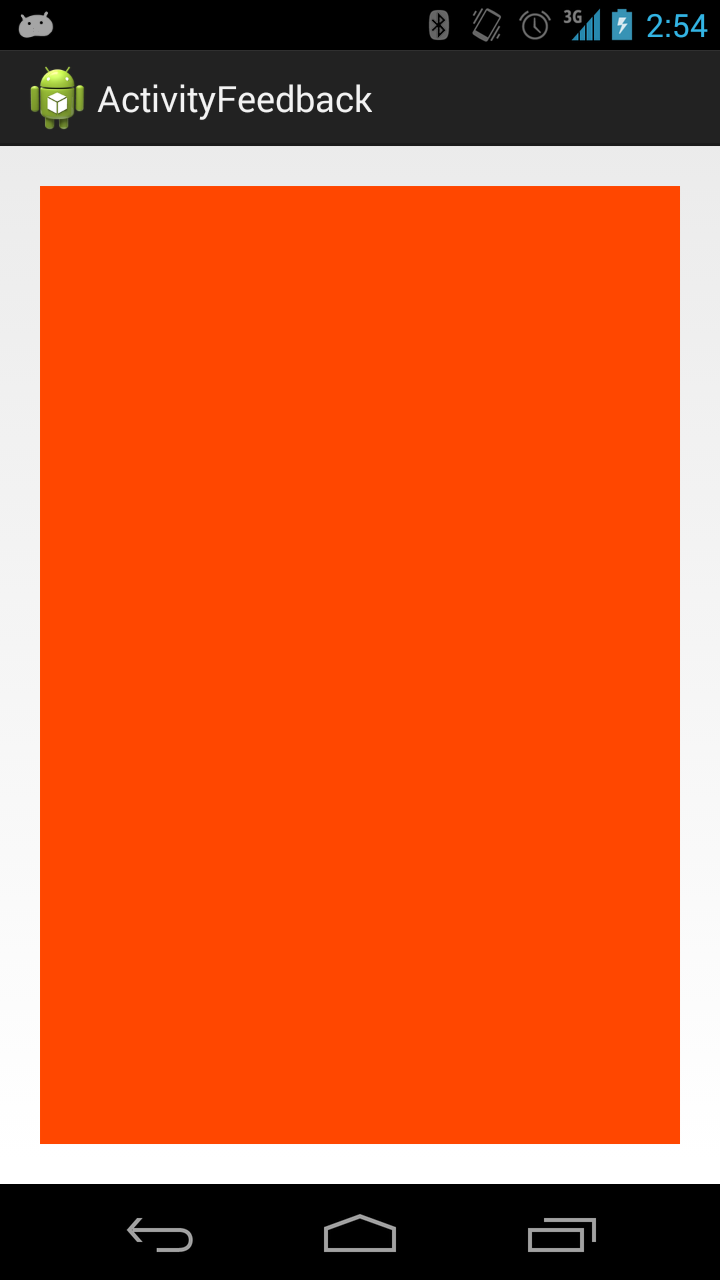
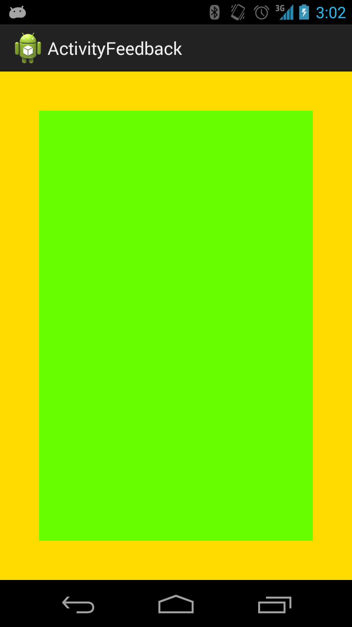
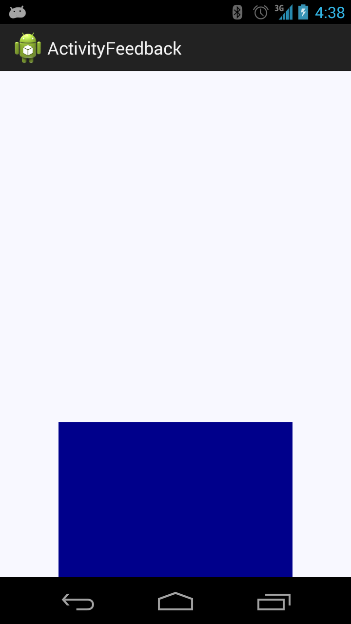
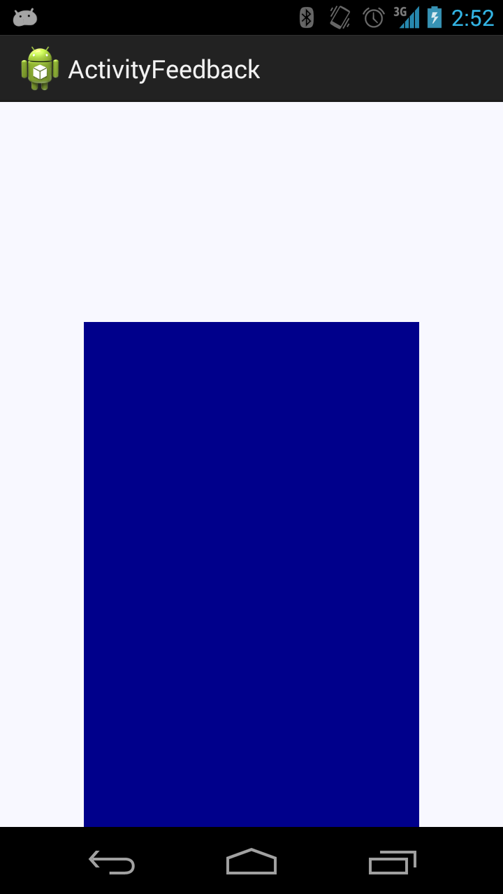
The views were variations over a bar changing height and a box changing color. We read about the bar feedback in [37] describing its clinical usage in ADHD treatment. The goal for the trainee is to raise the bar which in our case represents the magnitude of alpha waves. The basic bar feedback is shown in Figure 4.3e. The feedback consisting of a box changing colors was used in the Smartphone Brain Scanner alpha feedback training application as mentioned in the Background Chapter 2. In our case, the box gradually change from red over yellow to green. The trainees goal is to make and keep the box green which represents high alpha magnitude. The basic bar feedback is shown in Figure 4.3c. Inspired by the Smartphone Brain Scanner alpha feedback training app (Section 2.4.3) - which included another feedback in which performance history was visible - we implemented a version of each interface showing recent performance history of a sliding time frame of 30 seconds.
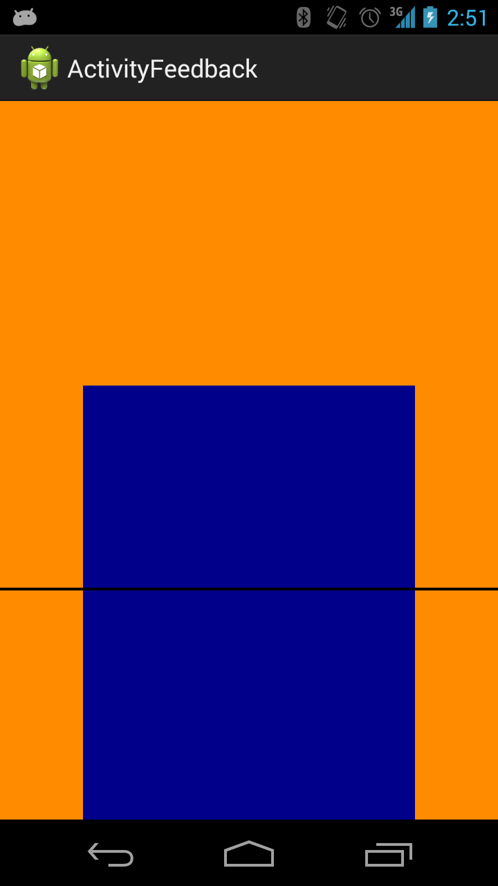
In the case of the box feedback, history was visible in the frame color - see Figure 4.3d. In the case of the bar, we implemented performance history in the form of a horizontal line showing performance history of a 30 seconds sliding time frame. Additionally, we visualized performance history of the entire training session in the form of background color changes - see Figure 4.3f. From our initial experience with the feedback bar, we thought the rather violent movements from low to high due to the intrinsic variance in alpha magnitude might introduce EOG noise. Therefor we made another variation of the bar interface in which the bar only grows. High alpha magnitudes makes it grow fast while low alpha magnitudes slows the growing down or stops it completely (Figure 4.3g).
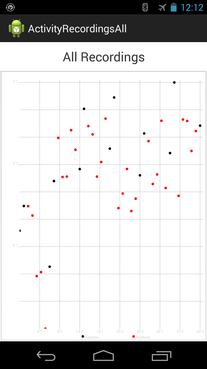
In sum, the prototype featured: (i) alpha feedback training through 5 different feedback views; (ii) individual alpha peak detection; (iii) alpha feedback training based on flexible alpha band definition; and (ii-ii) a view showing performance history in a plot (Figure 4.3h).
Using the app relied on the following sequence of actions:
- The user should turn on and mount the MindWave BCI and launch the Android application prototype.
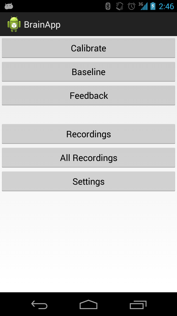
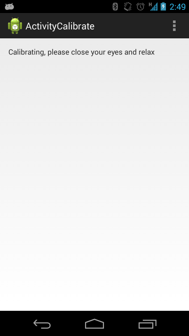
- The user should calibrate according to the individual alpha peak which is done by pushing the "Calibrate" button. The alpha peak frequency is used to delimit the alpha band for which to give feedback on.
- The user should record a baseline while under influence of random feedback which is done by pushing the "Baseline" button. The baseline is used in mapping the current alpha level to a feedback state. Furthermore, the baseline recordings are used to track alpha activity gains over time, the training effect of using AlphaTrainer.
- The app is now ready for training which is started by pushing the "Feedback" button.
The prototype app uses standard Android UI components (see Figure 4.3a) and the interaction form is manual as it is clear from the training procedure listed above. In designing and building the prototype we thought in terms of availability regarding app functionality and the information dimensions present in the feedbacks (for example feedbacks showing current alpha state + performance history).
Figure 4.3: Screenshots from the early prototype Android application using default Android UI components and manual interaction.
We tested the prototype informally on ourselves, fellow students, friends and a domain expert within BCI and HCI. From our testing three notions became clear.
First, we had to revisit our manual interaction and focus on accessibility regarding app functionality. It is not enough that the individual alpha peak can be determined, baseline can be recorded, etc. when relying on the user to calibrate (twice a day) and record baseline (once a day) - the user should not even have to know about these concepts. We shifted our focus from availability to accessibility in delegating the responsibility of taking appropriate actions to the app by means of a proactive interaction described below in the design of AlphaTrainer (Section 4.3).
Second, we gained several important insights about the 5 feedbacks. Interestingly, the bar height was perceived inversely proportional to how it was designed. By design, a high bar represents high alpha from an alpha performance metaphor "more alpha is good". However, some subjects experienced the interface expressing state of mind from a "low mind activity is good" where the obvious goal state of the feedback would be a low bar. We adopted the latter metaphor when designing a new set of feedbacks for the next generation of interfaces. However, the bar was generally experienced to be unpleasant for other reasons - namely due to its radical shifts - why we excluded it from this point. During the testing of the prototype, the idea of supporting other modalities than sight was generated. This expanded the design space of the feedbacks and led to the development of audio and tactile feedbacks. We ended out with a set of 5 feedbacks: 2 visual (1 with history), 2 auditive (1 with history) and 1 tactile. They are described below in the design of AlphaTrainer (Section 4.3).
Third, we learned that the immediate impression of the app through the UI design was an important part of the general experience of using the app. When non-developers tried the prototype, they responded negatively to the standard Android layout (see Figure 4.3a) which looks a lot more rough than they are used to from other apps. We noted that the general user is not able to abstract away from the graphical layout. Since we wanted to deploy the app for real world usage, we wanted to remove this obstacle of users distancing from the app due to its layout. Assisted by a digital designer, we updated the graphical design. The result can be seen below in the final design of AlphaTrainer (Figure 4.4).
Finally the last iteration of our prototype consisted of a test and analysis by an interaction design expert and a pilot evaluation performed by our selves. This had a set of concrete outcomes:
- The app should yield training performance immediately after a training has been performed.
- When headset connection fails, try to reconnect and/or show the user as precise as possibly where the problem is.
- History of training performance should be kept in the simple app design with a high ink-to-information ratio [62].
This ends our chronological journey through the design process. We now move on to describe the AlphaTrainer system in its current state - the version used in the user evaluation (Chapter 6).
4.3 AlphaTrainer
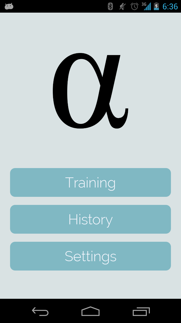
This chapter concludes with a description of the resulting AlphaTrainer prototype design. When the app is launched, the user is met by the home screen (Figure 4.4a). The home screen contains a logo and the 3 buttons: "Training", "History" and "Settings". The logo is the Greek letter alpha, which we imagine the user of AlphaTrainer (our personas) might recognize. The colors form a toned down blue palette and in conjunction with the logo we aim at conveying that AlphaTrainer is a serious tool.
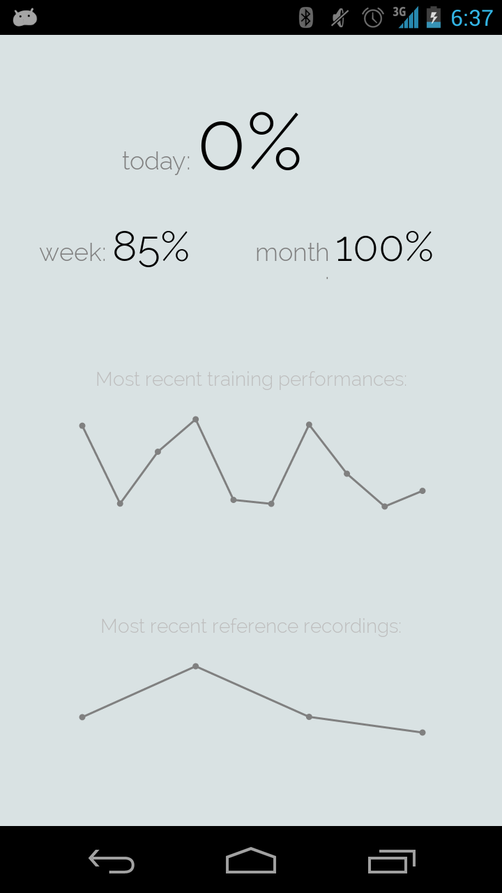
(i) Training history (per day, week and month). Plots the last 10 feedback recordings and the last 5 reference recordings.
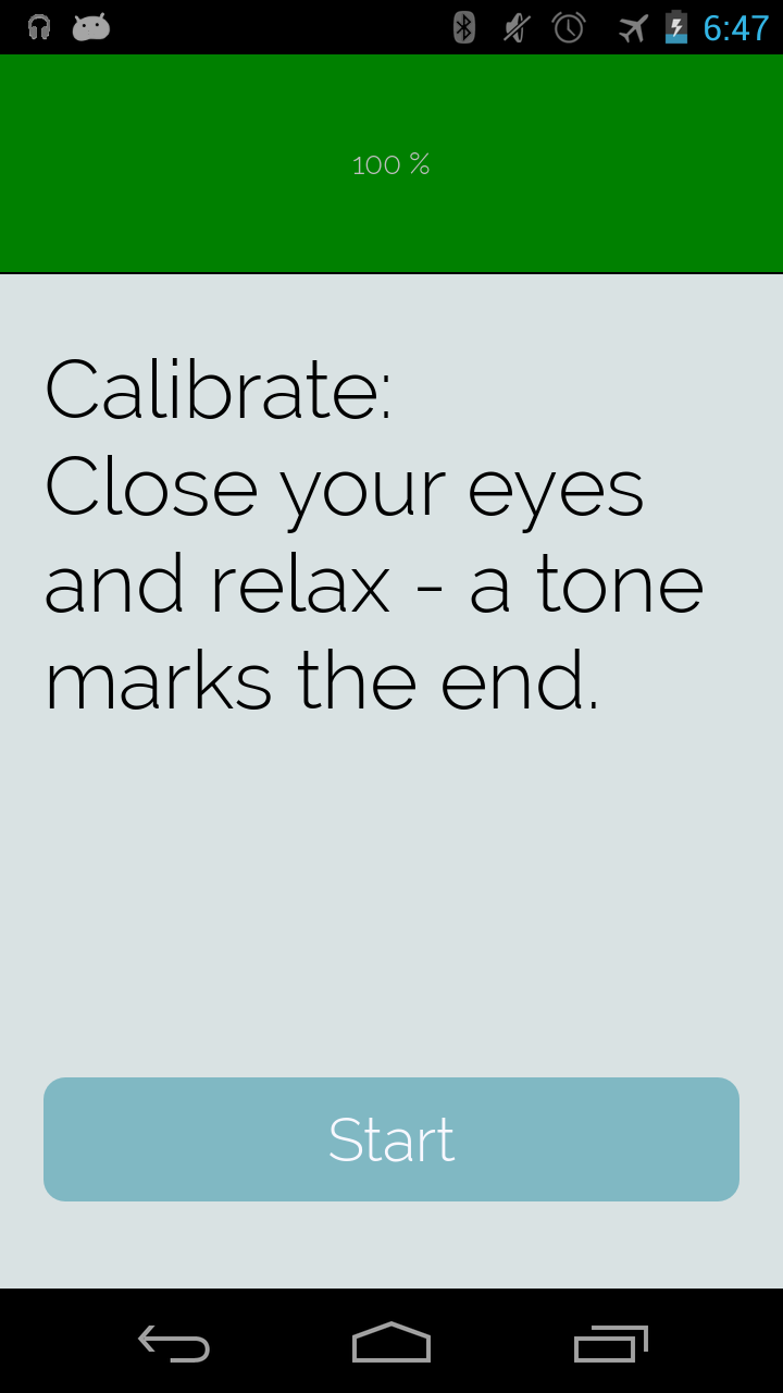
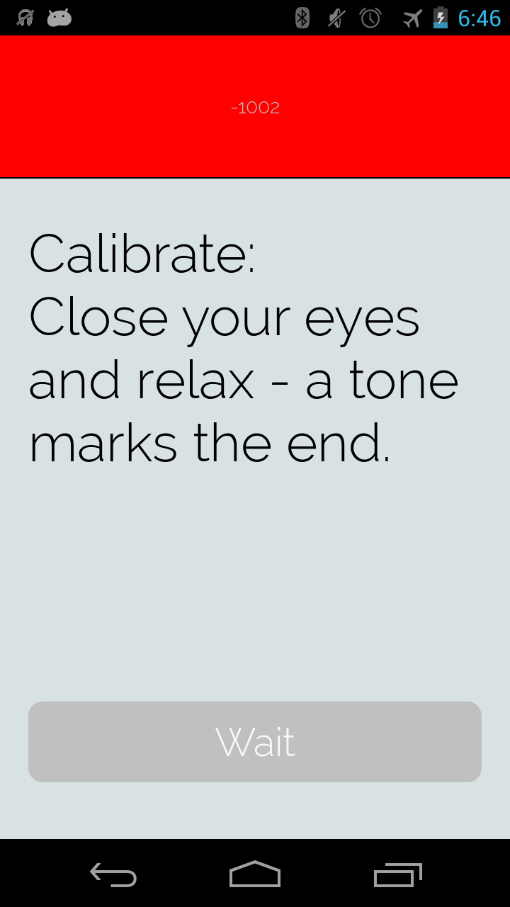
Figure 4.4: Screen shoots from the app flow of the final AlphaTrainer Android prototype.
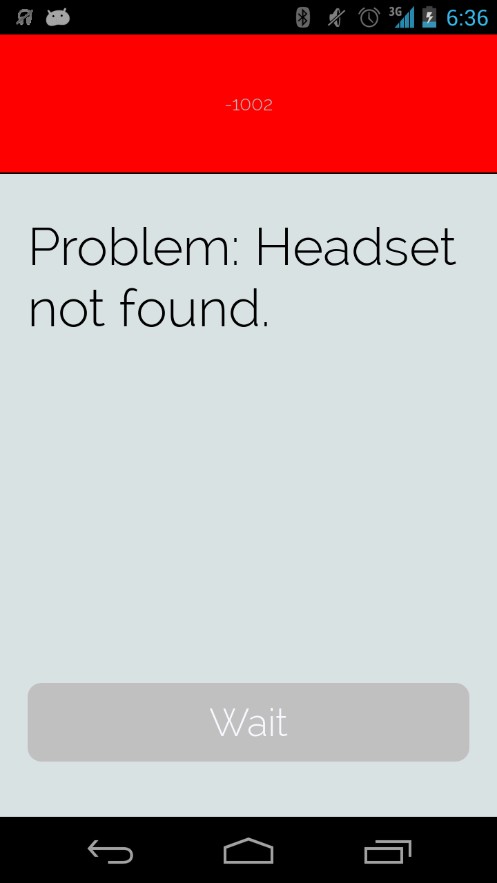
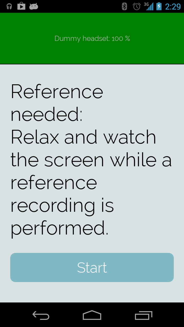
When the user clicks "Training", the app takes on a proactive interaction. It decides whether it needs to calibrate or to record a baseline before training can be performed. The appropriate action is decided from these rules: (i) if calibration has not been performed within 8 hours, calibrate now; (ii) if a baseline has not been recorded today, record one now; finally (iii) if the first two criteria are met, the user is set to perform alpha feedback training. The headset connection status is shown in top of the screen both as a number (0 - 100%) and by a color varying between red (0%) over yellow (between 0% and 100%) to green (100%) (Figure 4.4b). While connection is not yet established, the button for starting the appropriate action is grayed out. Should connection to the headset fail, the app will try its best to tell the user what the problem is - for example in case the headset is turned off (Figure 4.4d). The app continuously tries to establish connection while being inside the "Training" area.
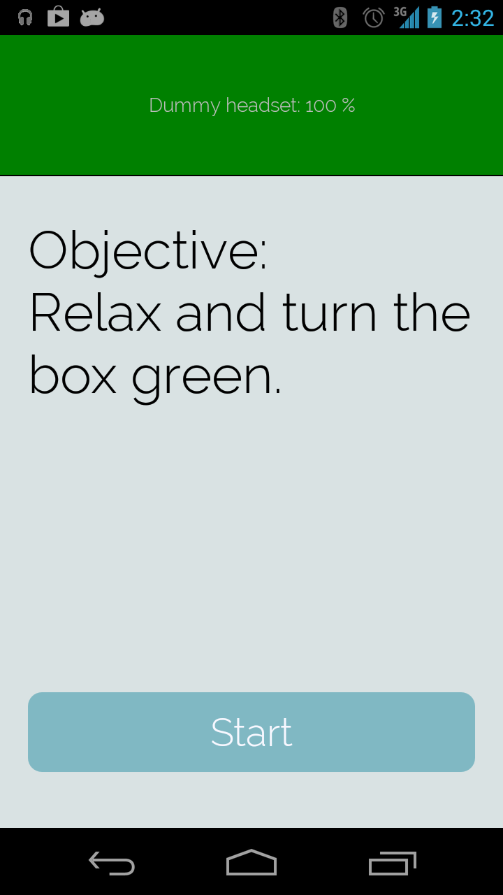
When ready to perform alpha feedback training, the app looks up which feedback has been selected in the settings. The trainees objective is presented, e.g. "Relax and turn the box green" in case of the box changing colors feedback mentioned earlier. We ended up with 5 different feedbacks:
- Box changing colors. This feedback contains no performance history (Figure 4.5a).
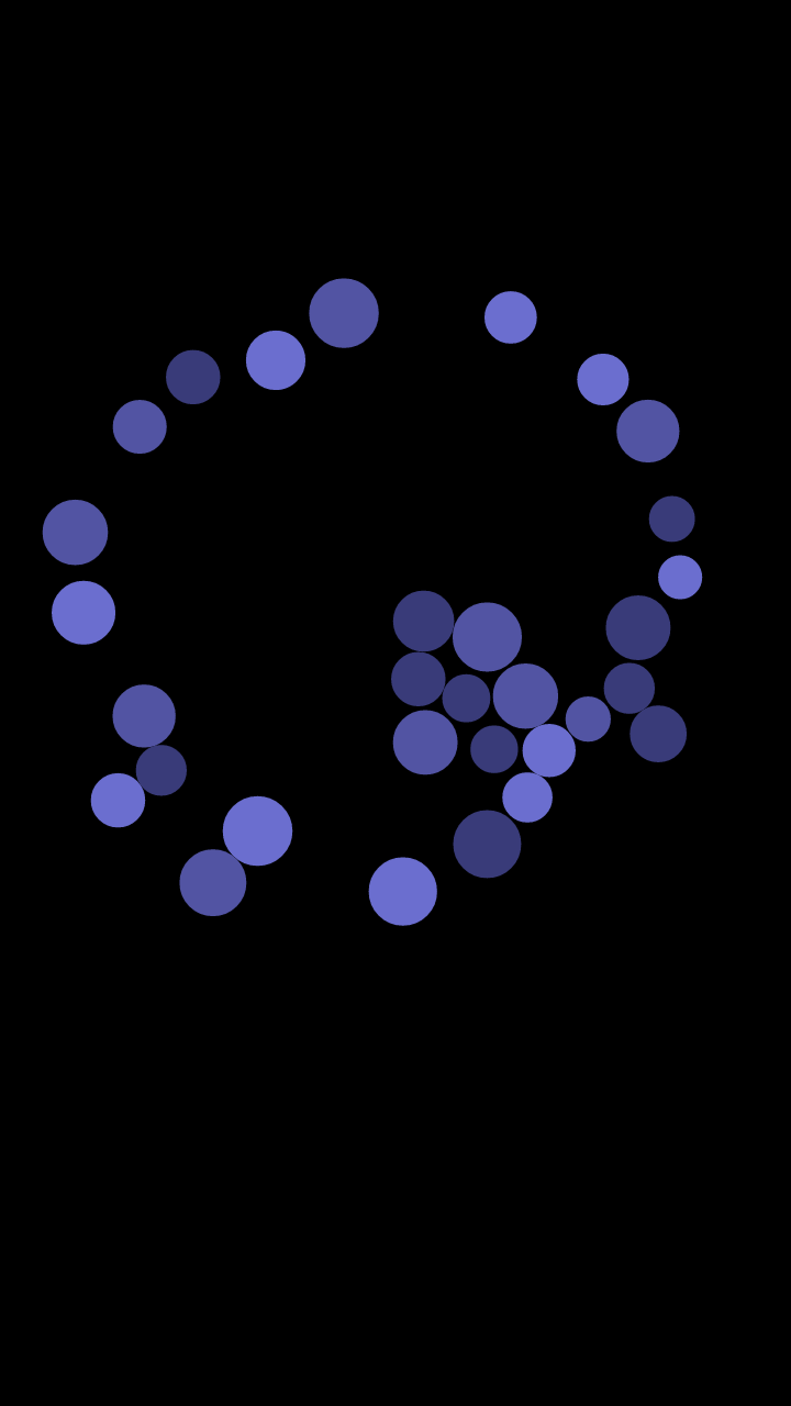
- Circles that move according to alpha level from the logic that high alpha amplitude (quiet state of mind) makes circle movement less. The circles are affected by gravity which conveys the recent performance history - when alpha level increases, it takes some time for the circles through the gravity to reach a state in which they are still (Figure 4.5b).
- Vibration feedback in which high alpha amplitude makes the phone vibrate less. This feedback contains no performance history (Figure 4.5c).
- Tone generator in which the pitch of the tone represents the current alpha level from the logic that high alpha amplitude (quiet state of mind) lowers the pitch. This feedback contains no performance history (Figure 4.5c).
- Bell sounds appearing in which the number of bells represent the alpha level from the logic that high alpha amplitude (quiet state of mind) makes a quiet sound scape by having fewer bell sounds appear. When alpha level increase, it takes some time for the bell sounds to disappear. Thereby the duration of the bell sounds convey performance history (Figure 4.5c).

(c) Vibration, tone generator and bell sounds - they all share the same screen instruction. Objectives make less vibration, lower pitch of tone and less bells.
Figure 4.5: Screen shoots from the 5 feedbacks of the final AlphaTrainer Android prototype.
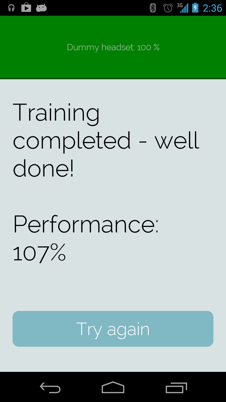
After a training has been performed, the user is immediately presented with a number representing performance in percent. This number is calculated by comparing the currently ended training session to the most recent training before that (Figure 4.4h). The user can then choose to train again by pushing the "Try again" button. This concludes the "Training" area of the app.
When the user selects "History" from the home screen, she is presented with a simple history dashboard (Figure 4.4i). The training performance of current day, current week and current month is presented in the top and conveys the set of trainings compared to all training sessions performed. The dashboard also has two simple graphs showing the recent training sessions and the recent baseline recordings.
When the user selects "Settings" from the home screen, she is presented with a conventional Android settings screen which enables her to choose among the 5 feedbacks described above.
We have now presented the AlphaTrainer and are now ready to cover the actual implementations in detail in Chapter 5.
Footnotes
| [1] | http://www.hjernetraening.dk |
